Lueur by Clinique
Identity / Art direction / Bespoke Typeface / Packaging design
Tools: Photoshop, Illustrator, Adobe Dimension, Figma
A new versatile brand that appeals to both loyal customers and a new audience - Millennials and Gen Z. The brand highlights the natural beauty inherent in the untouched, pristine wilderness we are part of.
The design process for Lueur was a journey of exploration and creativity, rooted in the concept of celebrating natural beauty. Inspired by the intrinsic beauty of untouched wilderness, the concept emphasized natural radiance and individual uniqueness.

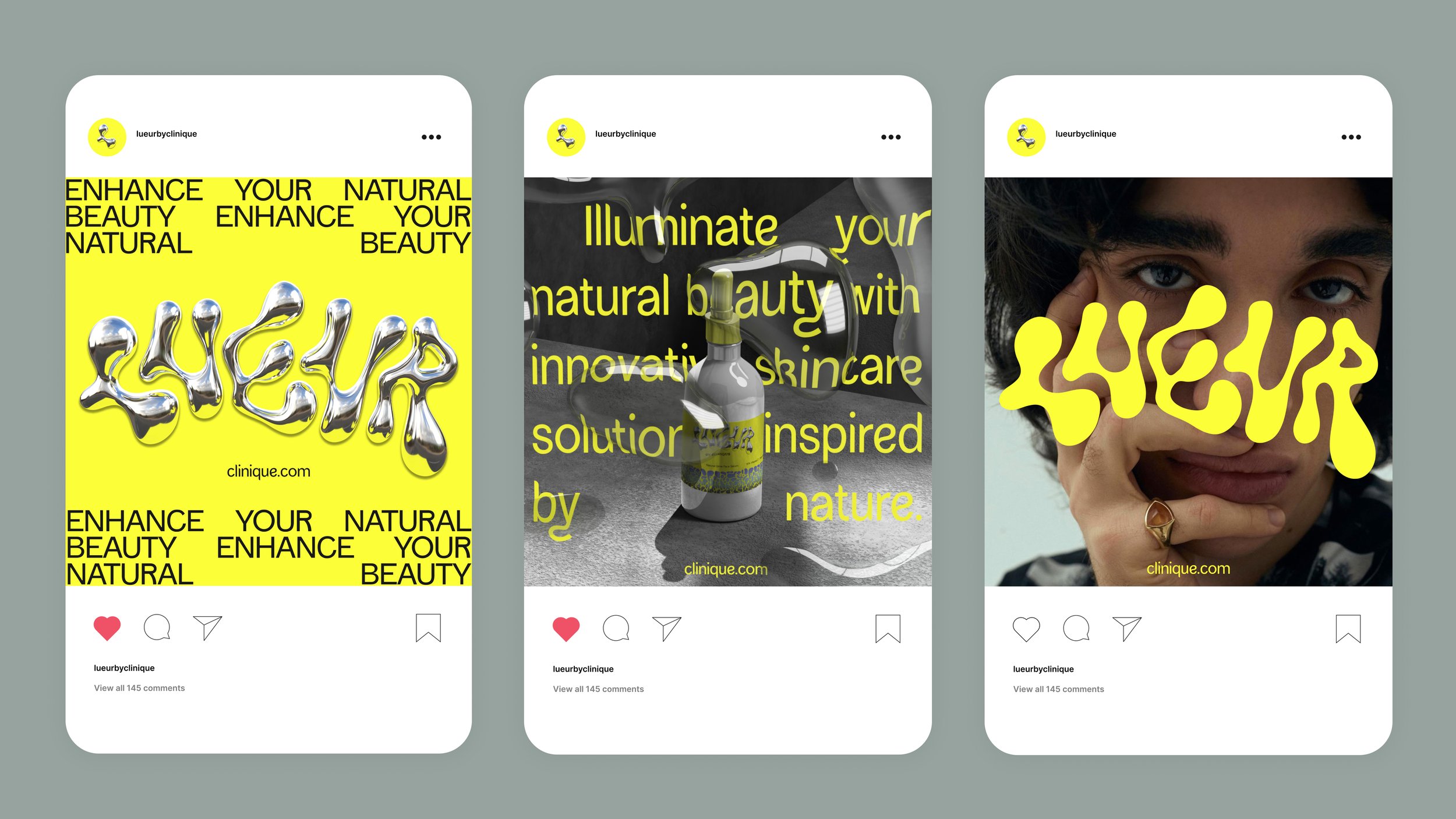
Through numerous iterations, the brand name "Lueur," meaning "glow" in French, was chosen to evoke the connection between the soft luminosity of healthy skin and pristine landscapes.
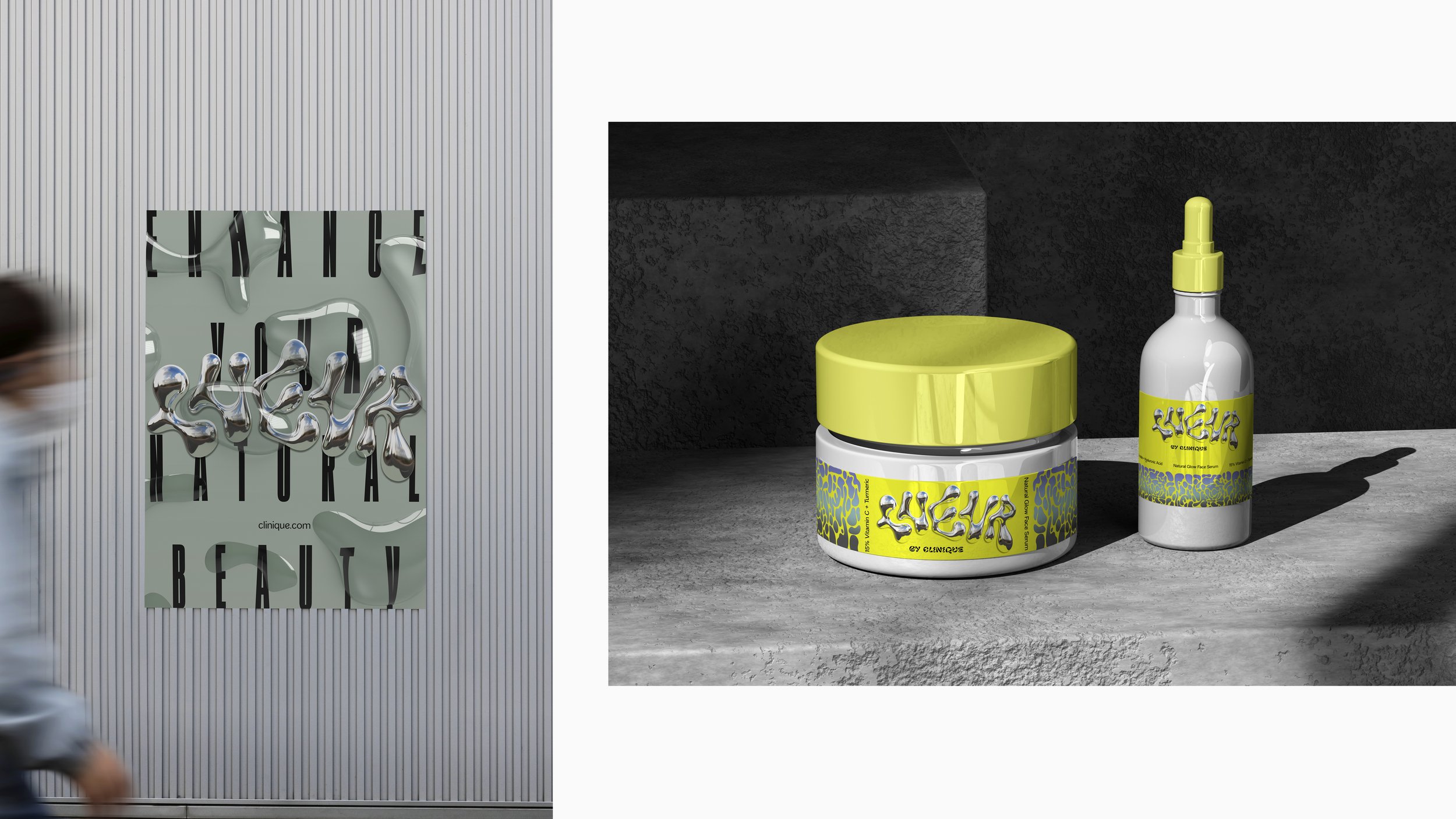
Following an extensive series of hand-drawn font explorations, a 3D molten iron effect was applied to the logo, striking a delicate balance between readability and visual impact.
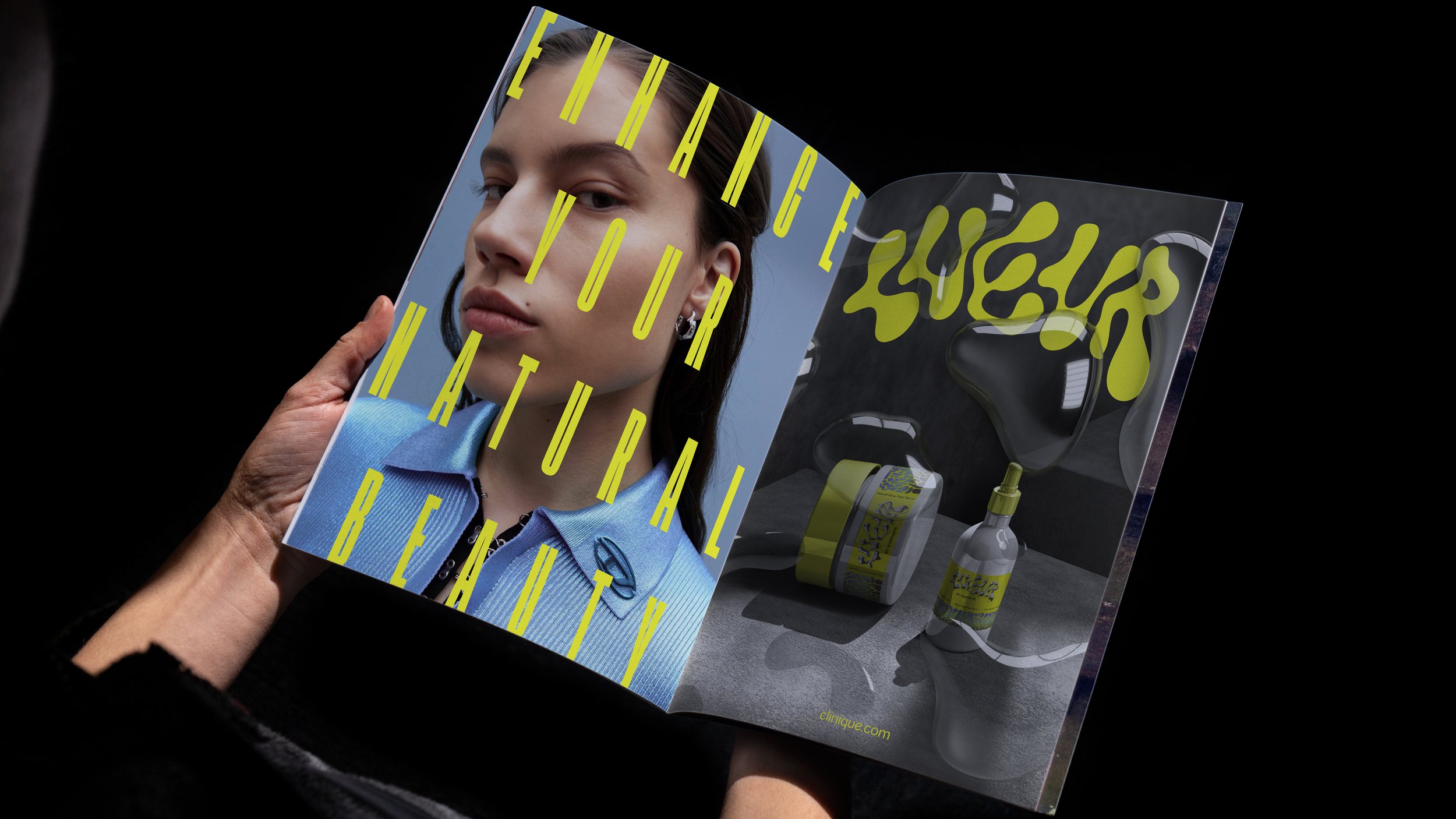
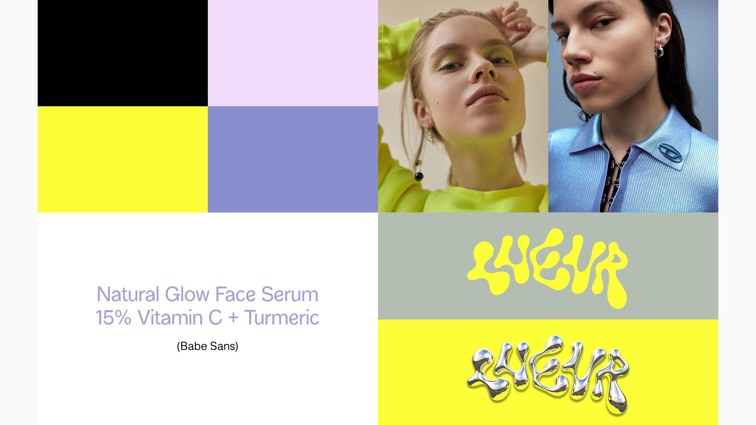
Color choices were meticulously selected from nature's palette, symbolizing night, sunlight, and sunset hues. Texture, such as the 3D water effect, was incorporated across posters, magazine spreads, and Instagram posts, fostering a deeper connection with the natural world.